Oxygen OS 15 vs Nothing OS 3.0 Which is Better: Hello friends, the most popular and trending smartphone brands, One Plus and Nothing, recently announced their upcoming System UI Update logs for their smartphones.
During the announcement, both brands revealed the interesting and amazing features of the new system UI update, which users may get very soon on their smartphone models.
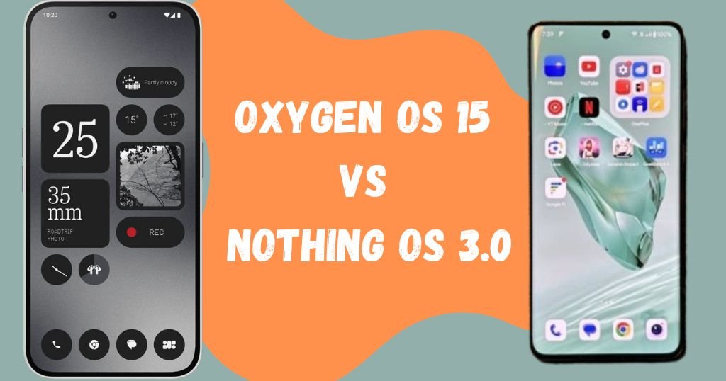
One Plus and Nothing also released the roadmap for the smartphone, which smartphone models get this new update and when the users accept this latest update on their handset all details are revealed on their official website. So in this post, we compared One Plus’s Oxygen Os 15 vs Nothing OS 3.0 based on privacy, AI features, animation and changes.
Oxygen OS 15 vs Nothing OS 3.0 Which is Better: One Plus 12 Vs Nothing Phone 2a
Animation
Firstly, animation plays a vital role in smartphones for better user experience. So both Oxygen OS 15 and Nothing OS 3.0 UI have smooth animation while opening and closing the apps. But Oxygen OS 15 animation little bit better compared to Nothing OS 3.0 in terms of closing and opening the application, you see smooth animation in Oxygen OS 15. Additionally, you get many varieties of Fingerprint animation in Oxygen OS 15.
Theme and Widgets

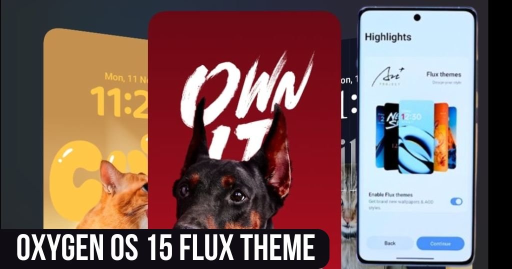
In Oxygen OS 15 this time you get various lock screen templates compared to previous updates. This time Oxygen OS 15 added a Flux theme in the lock screen section, now you can easily change your lock screen look. Secondly, with the help of the Flux theme, you can easily customize the text colour, wallpaper and clock design in Flux Template.

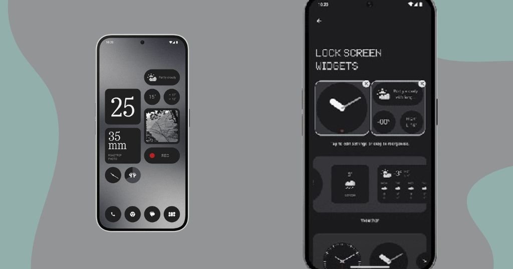
In terms of Nothing OS 3.0 where you can easily add multiple widgets on the lock screen. But this option is not available in Oxygen OS 15 System UI. If we compare both UI, Oxygen OS 15 looks very beautiful and you get different styles of text animation while unlocking the smartphone.
Oxygen OS 15 vs Nothing OS 3.0: Notification and Control Panel
Now, you see the notification and control panel separately in Oxygen OS 15, if you swipe down from the left you see the notification panel and swipe down from the right side you will see the control panel. If you want both in one place, now you can easily change to split to classic in the Notification Centre.
But in Nothing OS 3.0 you can’t find this option, here you will see both working in one place. Additionally, in Nothing OS 3.0, you can change the size and position of icons in the Control Panel. But you are unable to find this option in Oxygen OS 15.
Read: AirPods 7B21 and 7B20 Update: AirPods Pro 2 Latest Firmware & Airpods 4 Firmware Update
One Plus 12 Oxygen OS 15 Live Alert Capsule
This time One Plus added new features called Live Alert Capsule (Dynamic Island) in Oxygen OS 15, the same features previously available in iPhone smartphones. You can get notifications in the middle of the display near the front camera and the live Alert Capsule animation is also very smooth.
Icon and Nothing Phone 2a App drawer
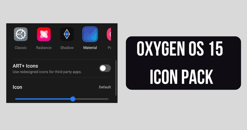
In Oxygen OS 15, you get a variety of icon packs with the help of this you can change the icons. This time you will see two new icons Radiance and Shadow, I liked the Shadow icon you get a feel of using dark mode on iPhone.

In the Nothing app Drawer, you get two options default app drawer and smart app drawer (beta). By clicking the smart app drawer you can categorize the applications like entertainment apps, call and message applications and many others. This smart app drawer allows users to use phones very easily.
Also Read: How to Fix Cricket 24 White Screen Problem 2024
Conclusion
Both the System UI Oxygen OS 15 and Nothing OS 3.0 are in beta stage now. Users may face some minor problems and lags while using the phone. But these small problems may be solved in upcoming stable updates. So let’s wait for the stable update.

